Timy
Product Design for a Messenger Startup
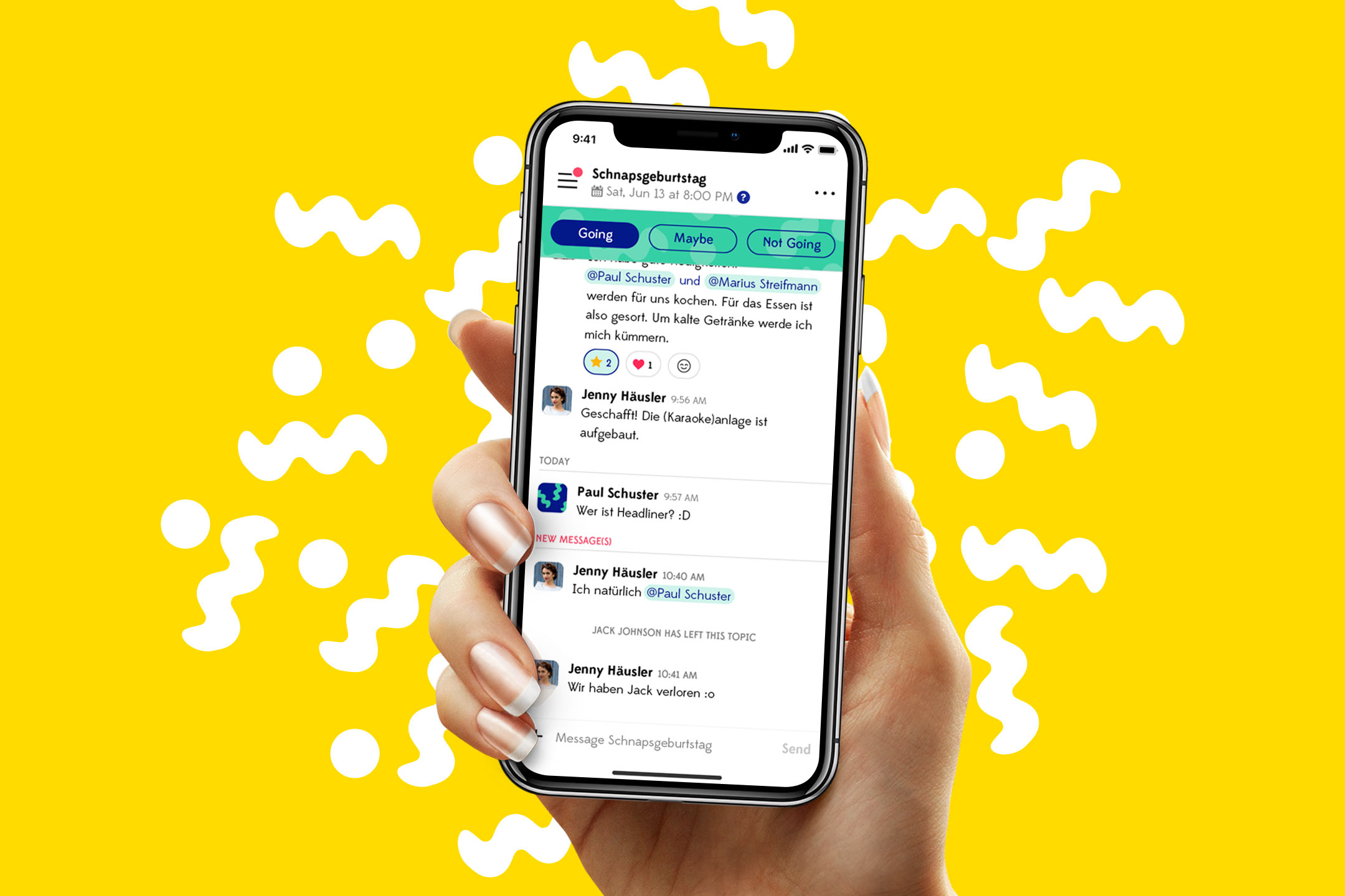
The tech entrepreneurs Philipp Möser and Katrin Apel approached us for help in designing a product for their messenger startup. Their mission was to create an app that allows associations, clubs and groups of friends to easily communicate and plan events in a collaborative manner.
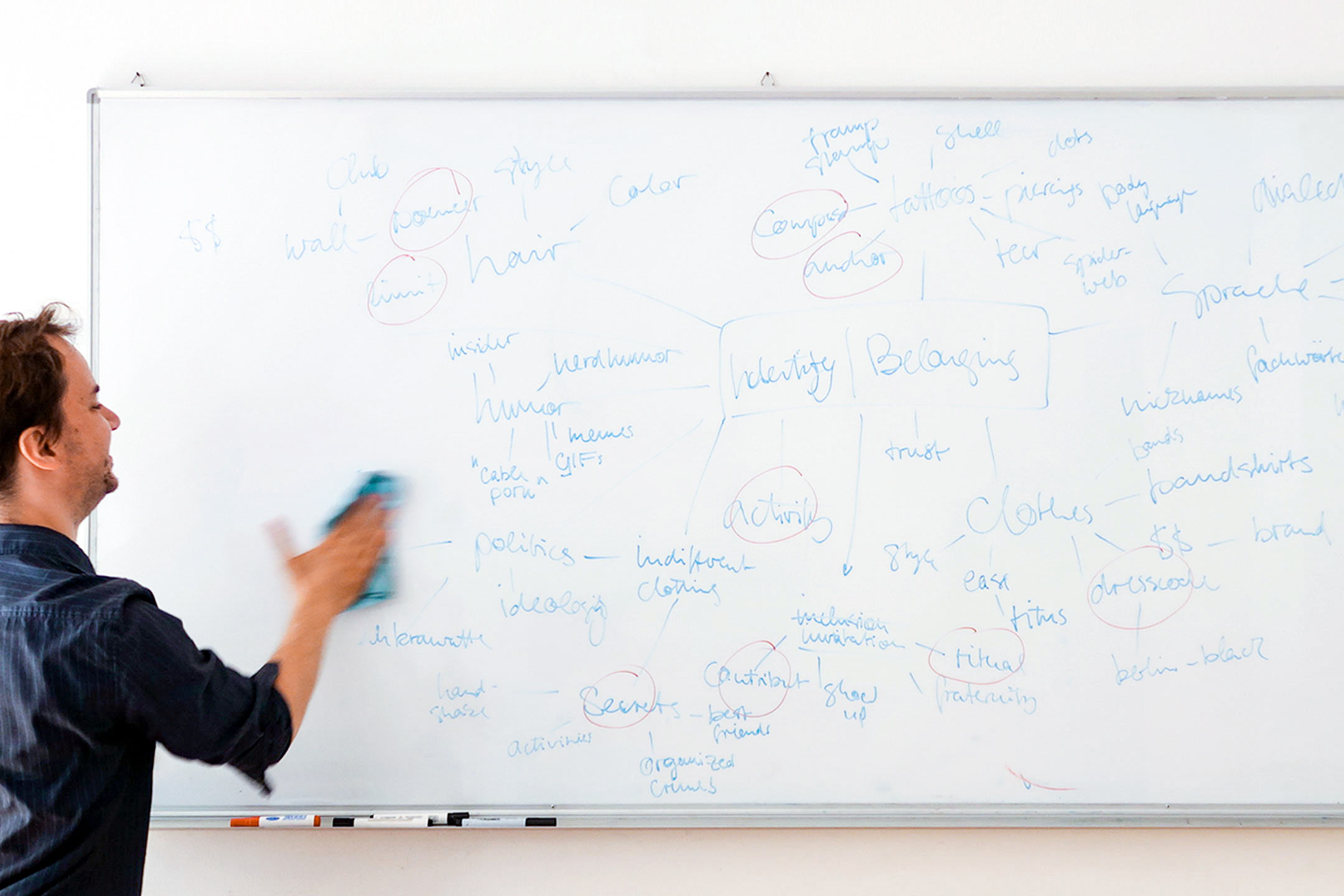
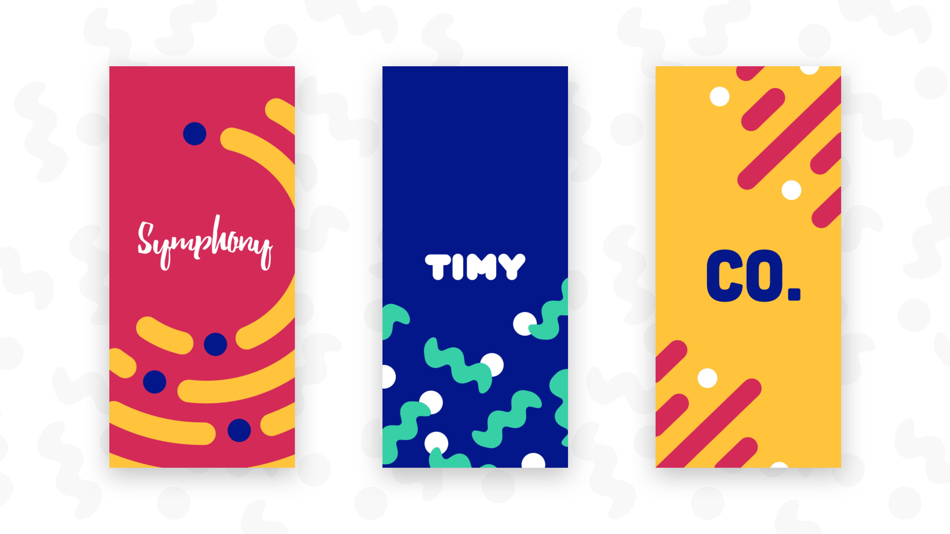
We started off with a naming workshop following the teachings of Alexandra Watkins, resulting in the name ’Timy’ reflecting the simplicity and playful nature of the brand. Initial brand design decisions such as naming, fonts and colors resulted in a style guide and design system which presented a solid foundation for the actual messenger product. We also focused on Mindful Design to create a conscious messaging experience without unnecessary noise or distractions.
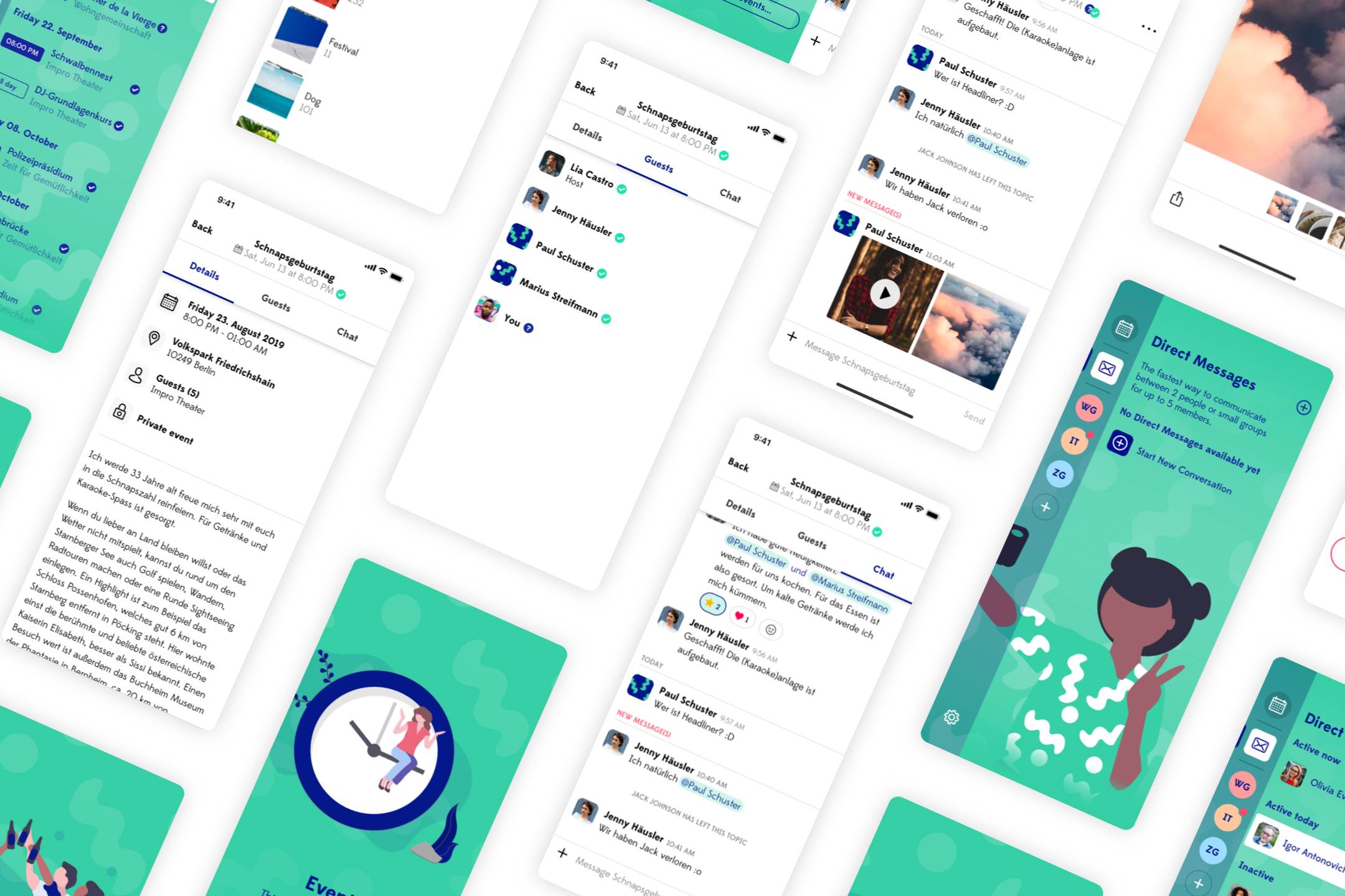
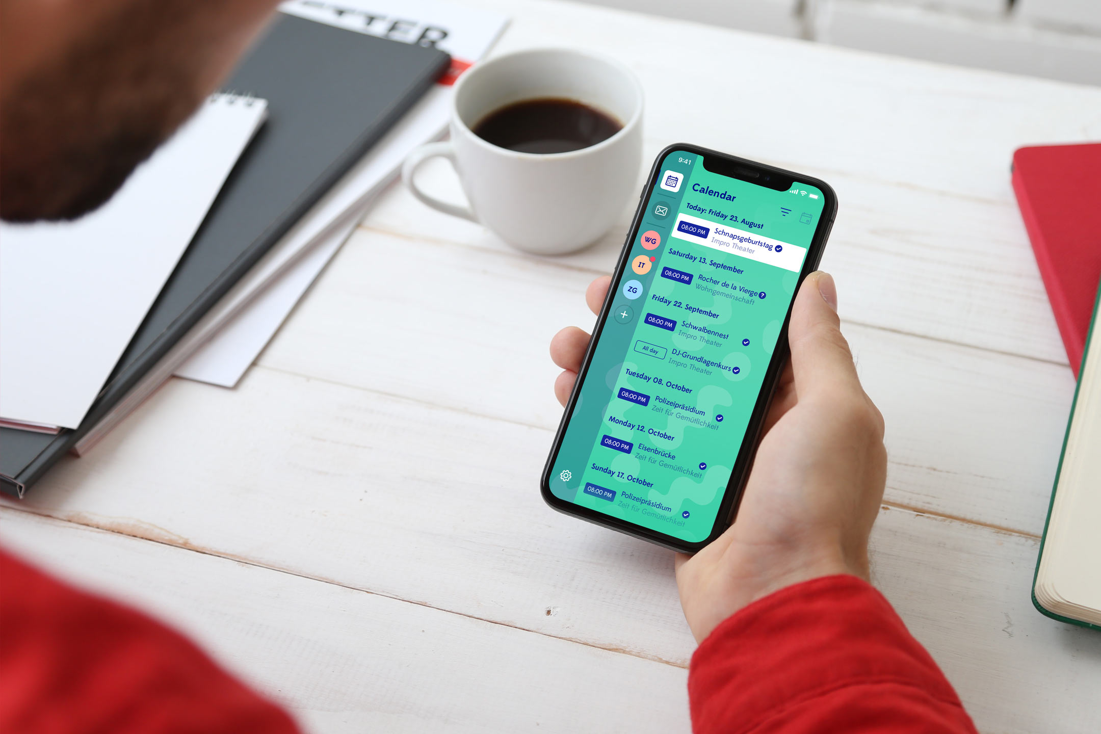
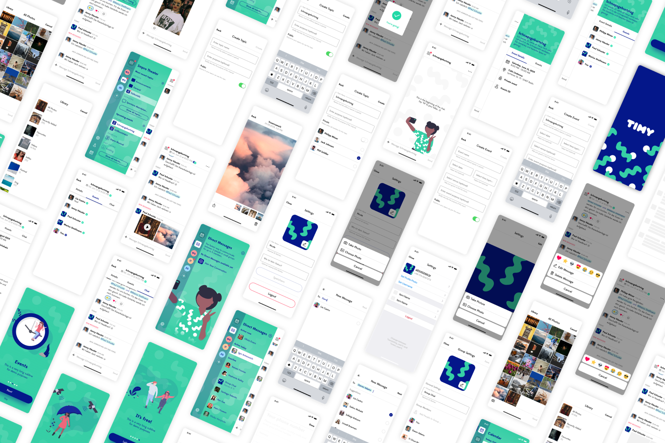
«We took some deliberate design decisions such as coloring the notification indicators green instead of red to give people ease of mind instead of FOMO.» says Nico Engelhardt, Co-Founder and UX Design Lead at Human Deluxe. «At the same time, the Timy experience should be sociable and fun, so we added some gimmicks such as a confetti animation which delights many people.»
Meanwhile, the founding team of Timy has decided to open-source their product and make it available to the world. Way to go!
- Client: Janoodle GmbH
- Industry: Communication
- Project Lead: Johannes Ippen
- Published: 2020
- Website: https://github.com/janoodleFTW/timy-messenger